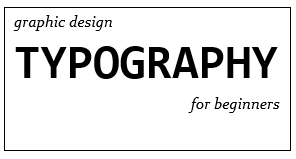
Typography noun.
– the style or appearance of text
– the art of working with text
retrieved from https://www.youtube.com/watch?v=sByzHoiYFX0 (0:23)
Before starting this project I never ventured out & used a font besides times new roman in my projects. As we progress with our tech inquiry project, we have to start thinking about everything that contributes to graphic design. For example, something as small as picking the font you use for a project can have a huge impact on how your audience perceives your work. This video by GCFLearnFree.Org describes the basics of working with typography, what fonts to use, which ones to avoid & how to make your work stand out above others. I found this video very helpful for beginning graphic designers like myself.
Good Fonts
- Serif fonts- perfect for more traditional projects, print publications; gives your document a more classy look
- Sans Serif fonts- more clean & modern than serif fonts; easier to read
- Display fonts- many different styles; very decorative so great for titles & headers but not large amounts of text
Bad Fonts
- Comic Sans
- Curlz
- Papyrus
- Anything else you would have used when creating a project for a middle school class
- All are outdated & overused
Tips & Tricks
- Less is more- limit yourself to one or two fonts per project
- Make combinations- experiment w/ using the same font but a different size, weight or style
- Opposites attract- decorative w/ simple, all caps w/ lowercase, tall w/ short, big w/ small
- Guide the readers eye towards what is most important in a project- make that different in some way
- Always use spacing that makes your text as easy to read as possible
Now that you know a bit more about typography I encourage you to give it a try! How can you turn an ordinary project into an extraordinary one?


